7 Things your Coworking Website
MUST HAVE
TO GET TOUR
SIGN-UPS!
Your close rate when you tour potential members for your coworking space should be about 50%.
Giving a great tour is typically not what coworking space owners and Community Managers struggle with.
The struggle is getting tours booked!
Your website is one of your primary lead sources (next to your Google My Business Listing)
Make sure your coworking website is optimized to get visitors to book a tour.

You don’t need a custom website to be a successful coworking space. Period.
There are many coworking spaces that perform really well on a WIX template. You can (and probably should) hire someone to customize the template for you, but you do not need a custom Wordpress or Squarespace site.
There is no functionality that you need on your website that requires more than a simple integration (see #3 below). You can add a “member login” button that takes your members to their payment and reservation portal (such as OfficeRnD or Proximity). You do not need to build this functionality into your own website.
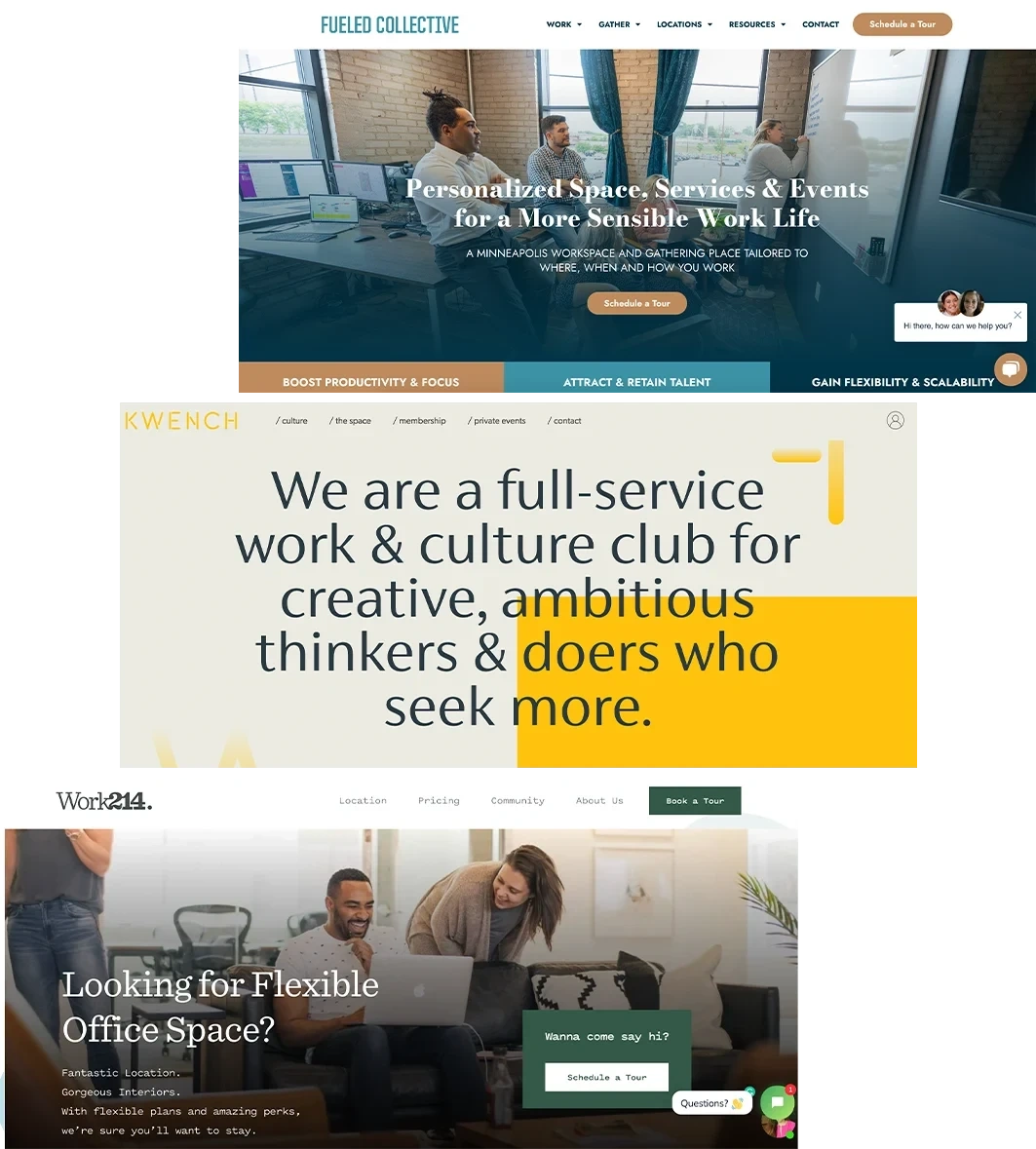
Immediately demonstrate to your potential member that you solve a problem that they have.
Be the guide, not the hero. Your website header is your user’s first impression. It should not focus on who you are and why you opened your coworking space. Your customer does.not.care. Put yourself in the role of the “guide” with your customer as the “hero.” Your hero is on a mission to be more productive, be more connected, build their business, etc. The headline on your website should address that. Read Building a Storybrand by Donald Miller and implement the recommendations. It will change your life.6
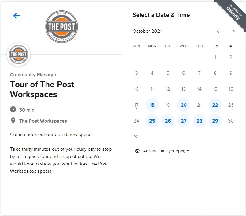
Don’t make your potential members play email tag.
Integrate an instant-booking app such as Calendly or Acuity into your website and connect it to your tour calendar (Google Calendar is the simplest shared calendar to use). If a member is ready to schedule a day of tours to find the right coworking space, but they have to play email tag with you over the date and time of their tour, they might get impatient and leave your space off of the list.

Add your coworking space address is in the footer on every page of your website.
It should exactly match how it appears on your Google my Business listing. Your local business website needs a full address in the footer in order to be indeed properly by Google. The other audience for your address is your potential member. Don’t hide your address under “About Us.” You know where you’re located, but they don’t and it’s the most important factor in their decision!
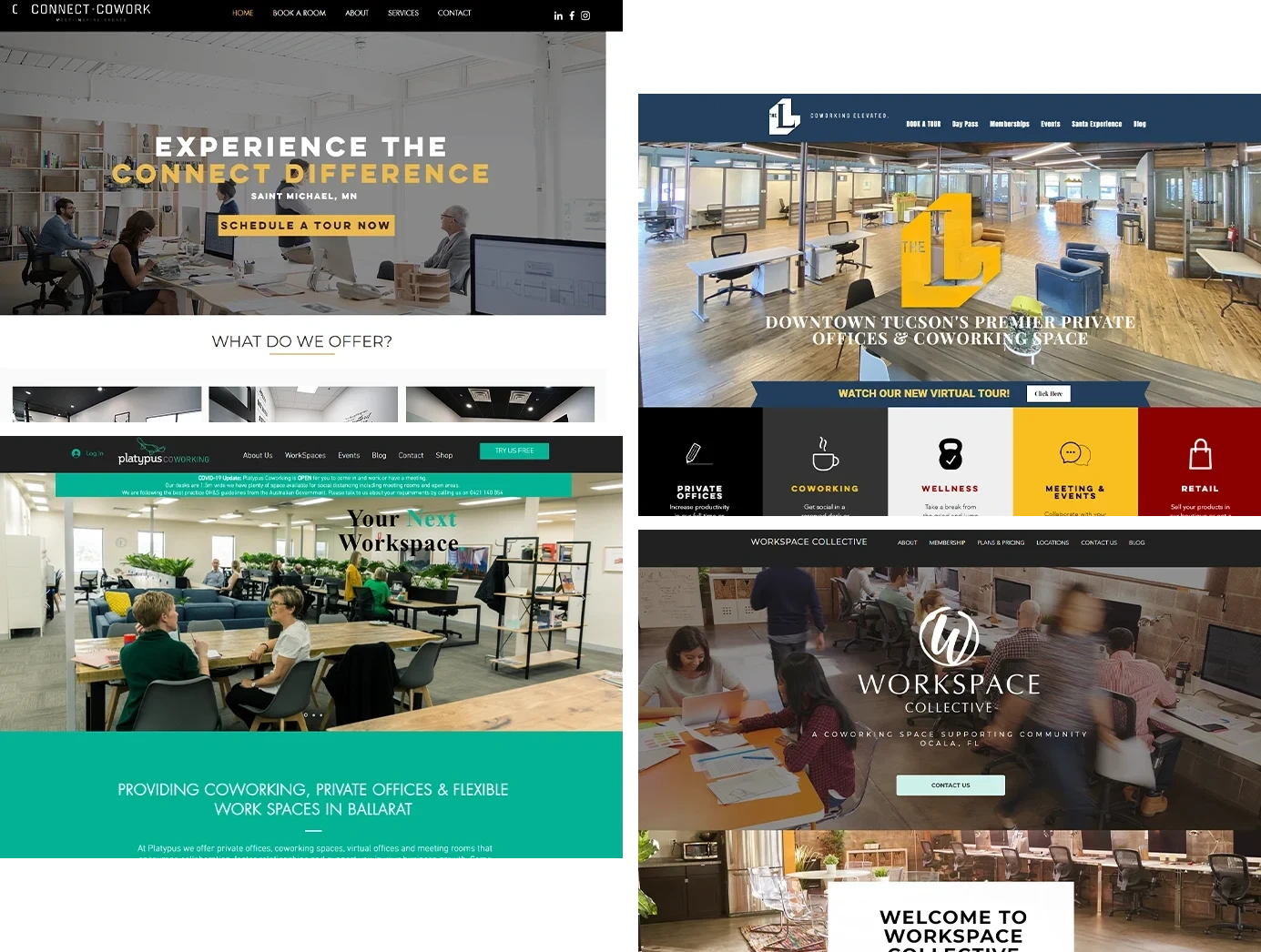
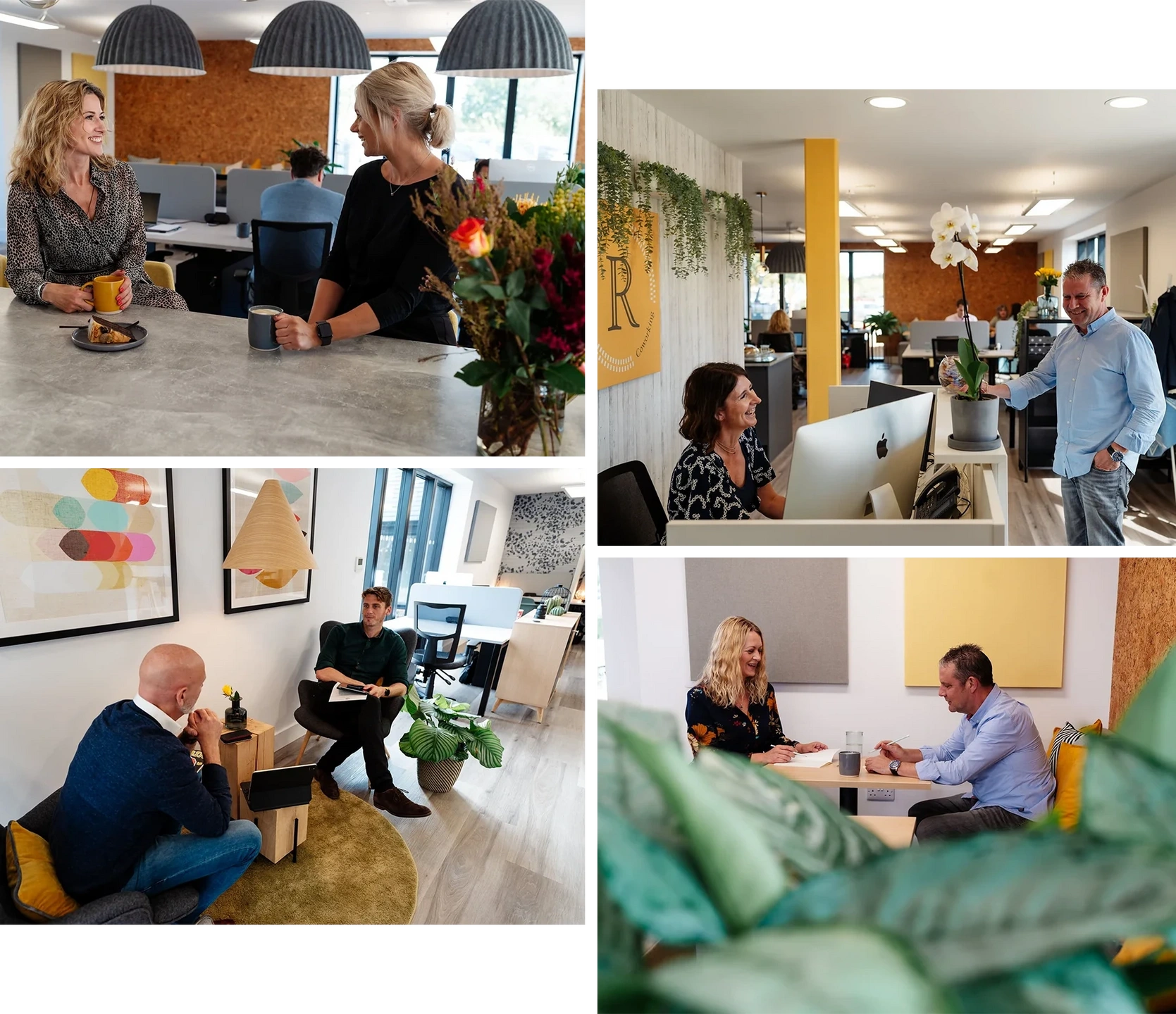
Show humans in your images.
Your potential members are not buying your Steelcase chairs and your custom-made community table. They’re buying access to other people. Not everyone wants to make a new best friend at a coworking space, but they’re also not robots.
Schedule a photo shoot for the week that you open, or even just before. Recruit friends and family as models. Create a shot list for a photographer so that you have photo assets of different orientations for your website, social media and newsletter. Karen Tait, founder of the Residence Inn Coworking, did a great job with her photo shoot.Here is the link to check it out: https://bit.ly/3oSomyE
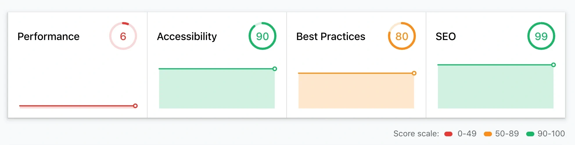
Avoid losing impatient members before your page even loads.
Optimize your site performance. Run a free report at web.dev to identify any issues. Your website performance can impact your search engine optimization (SEO) and impact where you show up in the search results. If your website loads slowly due to large images, compress them using this free tool: tinypng.com
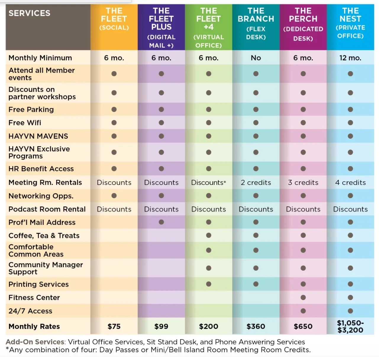
Don’t overwhelm your potential members
it will reduce their ability to take action (book a tour). Listing every amenity you can think of is not a competitive advantage. Offering more than 3-4 membership options will reduce your members’ ability to take action. Need data? Read about why more isnt’ awlays better in “The Jam Study.”
Your goal should be to convince your members that you solve their problem (see #1), make it easy for them to book a tour to learn more (see #3). Even when they come in, your goal on your tour should be to connect your offerings (solutions) to their problems (slow wifi at home, lonely at home, need more business contacts, etc.). Do not feature-bomb them on your website or in person.
A case study in “Monetizing Innovation” shares that an Internet company launched a new product for small businesses with 27 feaures. It bombed. They reduced the product down to eight features and then increased the price and it took off.
Instead of making a long lists of every single feature that you offer...some that are painfully obvious like coffee and Internet...what if your website just said
“Everything you need to do your best day of work...or your money back.”